Everyone is likely familiar with Mood and Tone, which are often used together in design. Though similar, they serve different purposes. So, what are they, and how do they differ? Today, Sixtygram will break down their meanings and key distinctions.
What are Mood and Tone
Both Mood and Tone help shape the main idea of a work. Mood describes the atmosphere and emotions it conveys, such as elegance and tranquility. Tone, on the other hand, reflects the creator’s perspective through storytelling style, color choices, and writing voice.
Difference of Mood VS Tone
- Mood creates the atmosphere and emotions for the audience without expressing personal opinions.
- Tone conveys ideas and helps communicate the creator’s perspective.
Importance of Mood and Tone
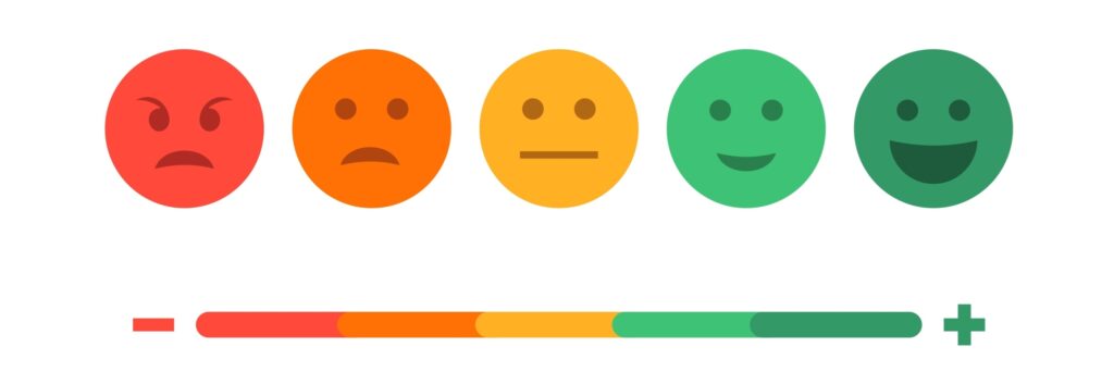
Mood sets the emotional core and atmosphere of a work, ranging from joy and vibrancy to anger and sadness. It also acts as a guide, helping the audience interpret and engage with the piece effectively.
Example of Mood in a Work
| Chic – Fashionably stylish | Vivid – Bright and intense |
| Gorgeous – Breathtakingly beautiful | Bold – Striking and courageous |
| Elegant – Gracefully sophisticated | Calm – Serene and composed |
| Fresh – New and refreshing | Charming – Captivating and enchanting |
| Dynamic – Energetic and fast-paced | Gentle – Soft and tender |
| Angry – Furious or upset | Graceful – Refined and poised |
| Modern – Contemporary and trendy | Sadness – Deep sorrow |
| Stylish – Trendy and well-dressed | Bright – Intelligent and radiant |
| Feminine – Delicately womanly | Youthful – Lively and youthful |
| Masculine – Strongly manly | Wild – Untamed and rugged |
In writing or literature, Tone reflects the author’s attitude toward their work. It can also convey a character’s thoughts and emotions through word choice, punctuation, structure, and storytelling flow.

Example of Tone in a Work
| Formal – Official or proper | Assertive – Determined and bold |
| Informal – Casual or relaxed | Humorous – Funny and amusing |
| Professional – Expertly written | Sympathetic – Compassionate or understanding |
| Friendly – Kind and approachable | Confident – Self-assured |
| Persuasive – Convincing and influential | Urgent – Pressing or critical |
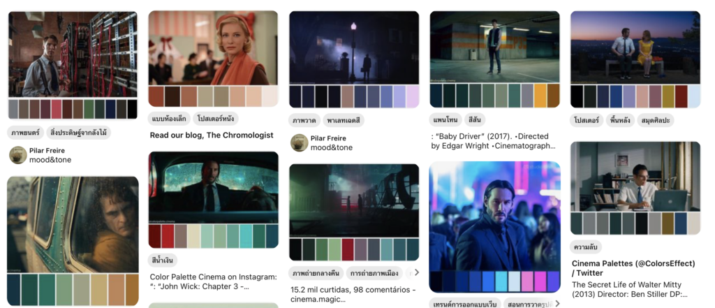
Tone in Design
In design, Tone refers to the shades of color, such as brightness or darkness, and the intensity or softness of colors. It also involves the depth or shallowness of a piece. Color tone is used in works to evoke emotions and convey meanings to the audience, as commonly seen in films and media.
Examples of Color Tone in Design
| Pastel Tone #ffd1dc |
Bold Tone #ff0000 |
Neutral Tone #f5f5dc |
Vibrant Tone #00ff00 |
Monochrome Tone #808080 |
| Earthy Tone #8b4513 |
Metallic Tone #c0c0c0 |
Romantic Tone #ffc0cb |
Minimalist Tone #ffffff |
Futuristic Tone #6b52ae |
Summary
In general, when creating a piece of work, Mood is used to set the atmosphere and emotions for the audience, while Tone expresses the creator’s personal perspective to engage with the content. Both Mood and Tone play a crucial role in effectively communicating ideas and presenting stories, allowing the audience to understand both the atmosphere and the creator’s reasoning.