Color grading is both an art and a crucial technique in video and film production that helps create mood, atmosphere, and identity for a project. For beginners, learning these basic techniques can significantly improve the quality of your work. Color grading isn’t just a technical step; it’s an artistic tool that allows creators to convey their vision and ideas through the management of colors and tones. Whether it’s creating a retro look for a film, making an advertisement feel fresh and engaging, or establishing a spooky atmosphere for a horror movie, color grading plays a vital role in shaping the final outcome.
Understanding the fundamentals of color grading not only helps you fix color issues that may arise during filming but also opens up the opportunity to create a unique look and style for your work. Continuous practice and development of this skill will allow you to transform ordinary footage into visually impactful content that effectively communicates, leaves an impression, and captures the audience’s attention.
1. White Balance Adjustment
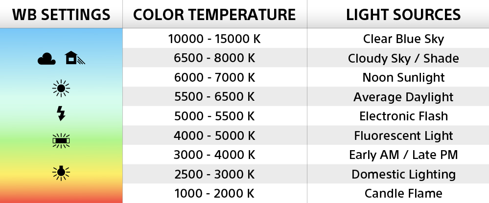
White balance adjustment is an essential starting point in color grading as it ensures the colors in the image appear natural and realistic. Begin by opening your video editing software and looking for the white balance tool. Most programs will offer options to adjust color temperature and tint.
When adjusting, pay attention to white or gray objects in the scene. If the image looks too warm (yellow or orange), adjust the Temperature slider toward a cooler tone (blue). Conversely, if the image looks too cool, adjust it toward a warmer tone. Additionally, if there is a green or purple tint, use the Tint slider to correct it. The key is maintaining balance—don’t over-adjust to the point where the colors look unnatural. Use references like the color of the sky, skin tones, and other natural objects as your guide.
2. Brightness and Contrast Adjustment
After adjusting the white balance, the next step is to adjust the brightness and contrast, which will add depth and visual interest to the image. In your editing software, you’ll find tools called Curves or Levels.
Start by adjusting the Midtones or the mid-brightness, lifting the center of the graph slightly to increase brightness, or lowering it to decrease brightness. Next, adjust the Shadows or dark areas by lifting the lower-left point of the graph slightly to add detail in the dark areas. Finally, adjust the Highlights or bright areas by lowering the upper-right point of the graph slightly to prevent losing details in the brightest parts. Creating a subtle S-Curve on the Curves graph will help enhance contrast, giving the image more depth. However, be careful not to overdo it, as this could make the image look unnatural.
3. Color Tone Adjustment
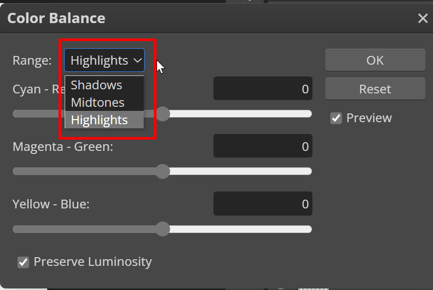
Color grading is the step that helps set the atmosphere and mood of the image. In your editing software, you will find tools called Color Wheels or Color Balance, which divide the adjustments into three parts: Shadows, Midtones, and Highlights. Start by adjusting the Midtones by shifting the point toward the desired color, such as adding a bit of orange or yellow to make the image feel warm, or moving toward blue to create a cooler feel. Next, adjust the Shadows, where it’s common to add a hint of blue or purple in the dark areas to create depth. Finally, adjust the Highlights by adding a touch of yellow or orange to give the bright areas a warmer look.
Color tone adjustments should be done carefully and with attention to detail, as over-adjusting can make the image appear unnatural. Consider the mood and atmosphere you wish to convey—warm tones may be suitable for scenes of happiness, while cool tones may be better for scenes that evoke sadness or mystery.
Creating short, creative, and engaging video content is the key to selling on TikTok. Use storytelling techniques that captivate the audience, showcase the product’s benefits, incorporate trending music, or even leverage challenges related to the product to enhance engagement.
Building a good relationship with customers helps establish trust and loyalty to the brand. Respond to customer questions in comments and messages promptly and politely. Consistently communicate to make customers feel cared for and valued.
4. Saturation Adjustment
Adjusting the saturation helps control the intensity and vividness of colors in an image. In editing software, you’ll find tools called Saturation or Vibrance. Saturation adjusts the intensity of all colors at once, while Vibrance targets only colors with lower saturation, preventing already vibrant colors from becoming too intense. When adjusting, start by increasing Saturation or Vibrance gradually and observe the changes, especially in areas like skin tones, the sky, and brightly colored objects. Be careful not to overdo it, as excessive adjustments can make colors look unnatural or “broken.”
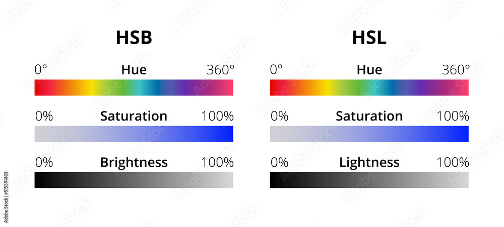
Additionally, you can use the HSL (Hue, Saturation, Luminance) tool to adjust each color individually, providing more precise control over the image’s color elements.
5. Special Effects

Adding special effects enhances interest and creates uniqueness in your work. Common techniques include using Vignette to focus attention on the center, adding Film Grain for a textured film look, and creating Light Leaks or Lens Flares for added depth.
To create a Vignette, find the Vignette tool in your editing software and adjust the intensity and size of the dark edges as needed. For Film Grain, you may need additional plugins or use built-in tools in some programs. Light Leaks and Lens Flares often require stock clips or special plugins. The key is to use these effects in moderation, ensuring they enhance, not distract from, the main content and match the style and mood of your work.
6. Skin Tone Adjustment
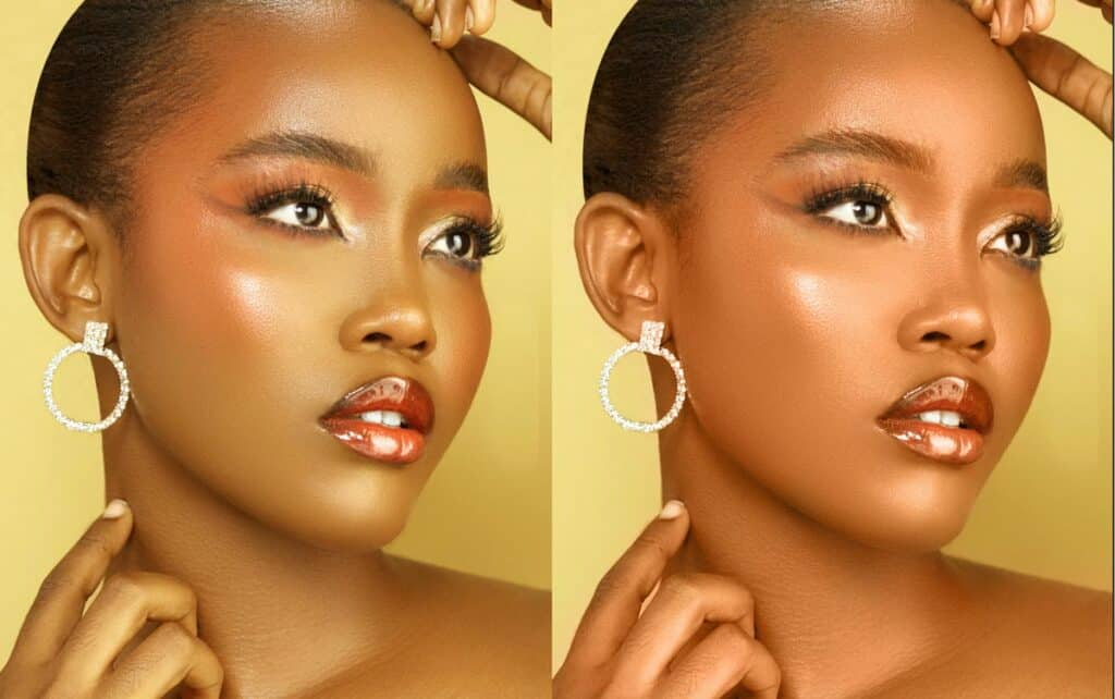
Adjusting skin tones is crucial, especially in shots with actors or presenters, as viewers can easily notice any discrepancies. Proper adjustments ensure the talent looks natural and healthy. Start by using the Selective Color or HSL Qualifier tool to isolate the skin tones, then carefully tweak the Hue, Saturation, and Luminance. Typically, skin tones are in light orange hues, so be cautious not to make the skin too red or yellow.
Use the Vector Scope tool to assist in adjusting skin tones. Balanced skin tones typically fall along the “Skin Tone Line,” which is the diagonal line on the Vector Scope.
Conclusion
Color grading is both a science and an art that requires practice and experience. Start by understanding the basic principles, then gradually experiment and develop your own style. Remember, there are no strict rules in color grading; the key is to create works that effectively communicate emotions and stories. Try applying these techniques to your own projects, and don’t forget to explore additional resources like online tutorials, courses, and analyzing works you admire. Consistent practice will help you refine your skills and create standout projects in the end.